PALETES RELEVANTES DAS TENDÊNCIAS ACTUAIS PARA O DESIGN GRÁFICO E DE EMBALAGEM
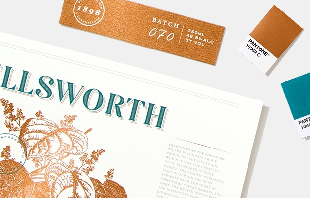
A cor é um elemento essencial do processo de design e deve ser considerada desde os estágios iniciais de um projeto. A palete de cores deve comunicar com a mensagem que pretende passar, porque os primeiros, e talvez os ÚNICOS, segundos de impacto que o seu produto transmite aos clientes são extremamente valiosos.
“It’s pretty hard to catch someone’s eye on a shelf in a retail environment without having something out there that shimmers, pops - really just draws them in. That's why we would recommend using a metallic to provide that extra oomph from a visual perspective on-shelf.”
- Ron Farnum, Damen Jackson Design Agency Founder/Owner
“In our visual society, where we are option saturated, attention-scarce and design-obsessed understanding how to leverage the power of colour to tell your story will help you better engage and create strong emotional connections with your target audience, and build greater brand equity in a marketplace where competition for share of mind, heart, and pocketbook is fierce.”
– Laurie Pressman, VP, Pantone Color Institute